27.1.12

Work Placements in London _


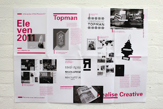
My first term this year was slightly interrupted by a couple of work placements I did in London. The first was a week at Topman Creative that I won last year in a competition set by Gill, one of the members of the graphic design team. The second was at an agency in Hoxton called Realise Creative. I met James; the boss at Realise when he came up as part of the Phil Thomas foundation, a scheme where design students can be sponsored as a way of supporting them through their final year and beyond. After showing him my portfolio, he offered me and another student a placement at his studio.

Overall, the three weeks were a really interesting experience and I was involved in some exciting projects. Although work experience isn't fantastic in terms of the depth of projects that you get involved in -especially in relation to a university project - but it is a great way of understanding what the 'real world' looks like. Rather than just add the work I was involved in to my portfolio for assessment, I thought it might be more interesting to create some sort of response.


I collated all the work I was involved in and put it into a folded up A1 poster that could tell the story of my three weeks in London. Since work placements are great additions to the journal, I thought I'd add snippets of that to it too. 


26.1.12

Topman post _


There's been a surprising amount of views on my post about some work I did for a Topman brief last year. Might have something to do with the 2nd years having just been set the brief though! I'm like Sherlock Holmes

23.1.12

Intro Type Foundry _


As an application for my 'Angst' typeface I created a while back, I decided to create a type foundry that would celebrate all the great typography based work that my course had designed. The name of the foundry is Intro Type - as third years I thought that introducing ourselves to the world seemed apt - and it primarily takes the form of a blog. However, as a way of promoting the foundry and to encourage the involvement of the year group, I created a publication.


The publication could be sold as a monthly magazine and each issue would feature a separate typeface designed by a student. That student could have creative control of the content of that issue. For my Angst issue, I created 2 limited edition posters, a dvd with the typeface file ready to use and a 'making of' film and finally a small book explaining the thought process that went into the creation of the typeface.


I am hopefully going to get another student to take part in this project by creating issue 2 of the Intro Type publication. Apart from it needing to have similar dimensions to issue 1, the content could be completely different. It will be exciting to see what might come out of it.


21.1.12

BRASSICCA LEAVES _

Roses Competition Brief - Sprout Clout

Roses asked to 'Make sprouts the coolest veg on the planet, and to sell sack loads all year around'. It seems that the main problem with sprouts is the stigma attached to them. For most people they think of the smell of farts. Because of this, I decided that the best approach would be to change the image of sprouts all together. By stripping the leaves off the sprouts, I created a new product that could have a similar impact as changing the name of a chinese gooseberry to kiwi fruit had, or how spinach leaves have become so popular as a salad leaf. The fact that there are recipes for both cooked and raw sprout leaves make this product believable. However, most importantly, by removing the core of the sprout, much of the bitterness that so many people dislike is removed too. I still wanted to keep the sense of humour that has evolved with the sprout, so I tried to keep the message sophisticated, but not too formal.


As a packaging solution, sophistication was key. I wanted the Brassicca Leaves to stand out above the rest of the leaf based products so I kept it bold and simple. I created two packaging solutions. One for the sprout lover who wouldn't need too much convincing and would buy a large amount of leaves. And then another for the sprout hater who may need a little bit of convincing. This packaging was far smaller and was more of a 'taster'. I'd imagine that the price range would be similar to that of the rocket leaf as if priced too highly, people would perhaps prefer to peel the sprouts themselves. I thought it was crucial to show the leaves in the packaging as I didn't want to shy away from the fact that they came for sprouts. It also enabled the consumer to understand what Brassicca Leaves were.


OFF THE PITCH & ON THE PERCH _

ISTD Competition Brief - Tweet Tweet

Off the Pitch, healthier than a half time orange.

The Tweet Tweet brief asked for you to explore the 'unique lexicon of language' involved in social networking and to create a network of participants. I chose to look at the way Premier League footballers interact with Twitter. It seems strange that despite their high profile, footballers continue to cause controversy on the site. A day doesn't seem to go by without another story about someone apologising for a lewd comment. With this in mind, I created a handbook for the 'Twits wot Tweet' in order to get them to improve their networking skills. I focussed on the wealth of clichés in football to create a set of rules that had to be interacted with to learn. This children's book theme seemed the best way to keep the footballer's engaged. 

4.1.12

Re bloggin' _


Just saw this on a course mate of mine Hannah's blog. She created them for our pop up shop and I'd forgotten how good they looked. My favourite part of the pop up shop. Apart from perhaps the money...