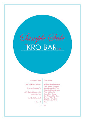
Today we had to re-design a crappy leaflet. Unfortunately, I managed to leave my leaflet t uni, so can't scan it in to show. However, this is my version:

I'm pretty pleased with it considering I spent the majority of my time during the session dicking around...
Had a pretty good chat with my tutor about needing to leave my comfort zone a bit. I suppose I'm getting quite good at designing in my own style so it would definitely be a good thing to try something new. She wants me to go bold, so the next brief I get, I'm making a concerted effort to avoid the use of light fonts and simple colours!
This website is the perfect start:
http://www.designsymposiumnorth.co.uk/
This sort of design never really crosses my mind but it should, it's bold, yet still simple.

No comments:
Post a Comment